

Det här är Öhlins nya visuella identitet
Svenska färgerna försvinner

Nya
För lite mer än ett år sedan fick vi reda på att det anrika svenska stötdämparföretaget Öhlins köpts upp av bromstillverkaren Brembo för motsvarande 4,2 miljarder kronor. Nu lanserar företaget en ny identitet och de klassiska svenska färgerna försvinner tyvärr. Loggan har gjorts om och man har infört en ny symbol för märket som man säger är en nytolkning av Öhlins klassiska Ö.
Mark Spelthaen som är Managing Director för Öhlins Group säger följande:
"Over the past 50 years, Öhlins has built a brand synonymous with racing excellence and cutting-edge suspension technology. While we have strived to remain at the forefront of high-performance, premium suspension, the visual representation of our brand has not evolved at the same pace. As we enter this exciting new era for Öhlins, our new visual identity positions us to continue our legacy into the future. It reflects the forward-looking, innovative spirit at the core of our brand while opening new opportunities to connect with and inspire enthusiasts."
Vad tycker ni?
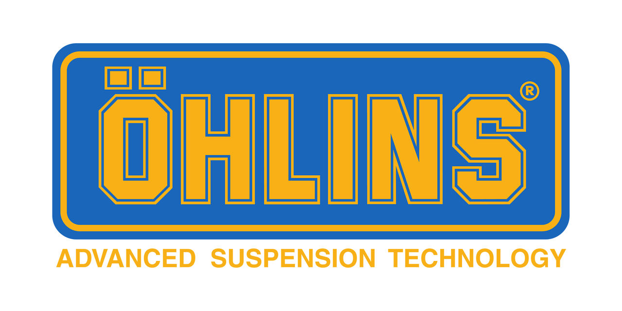
Gamla
Läs gärna våra regler!